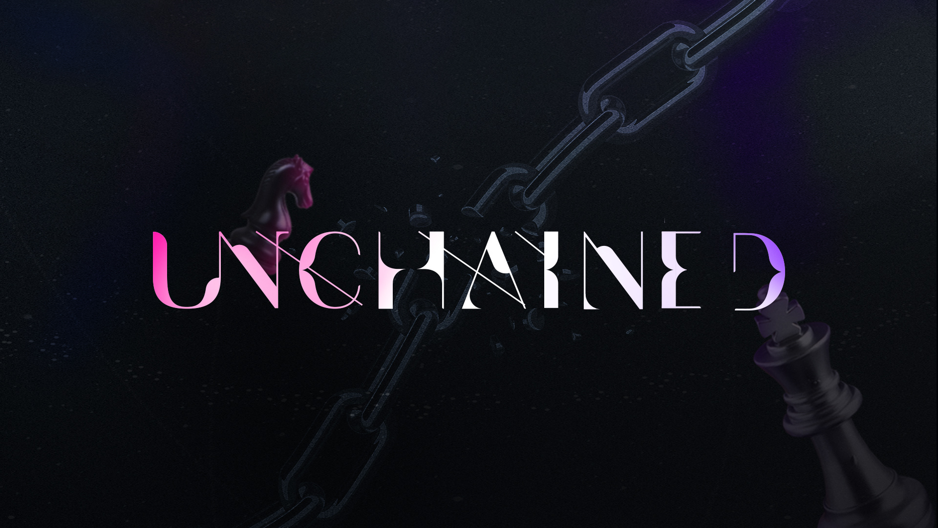
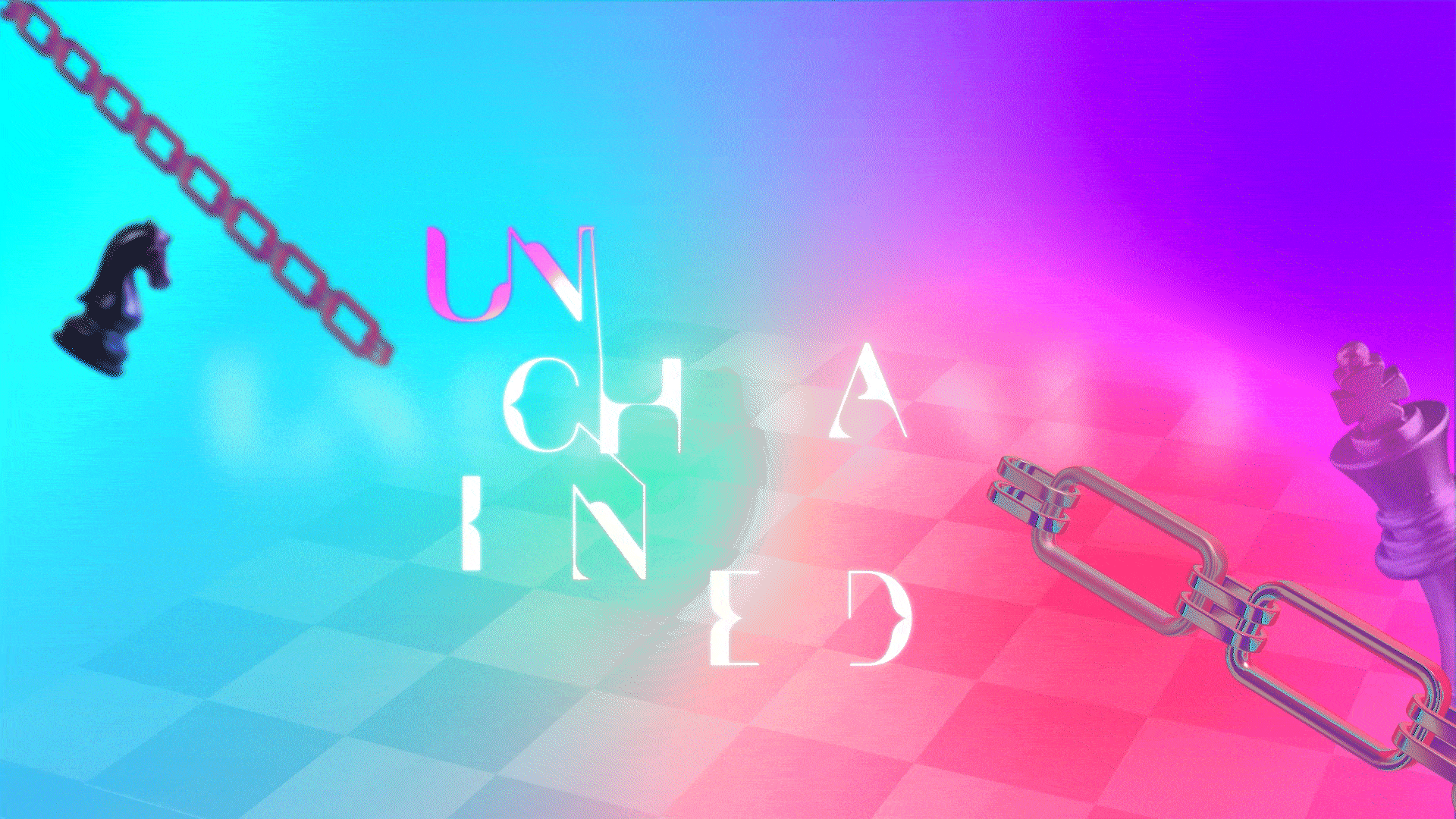
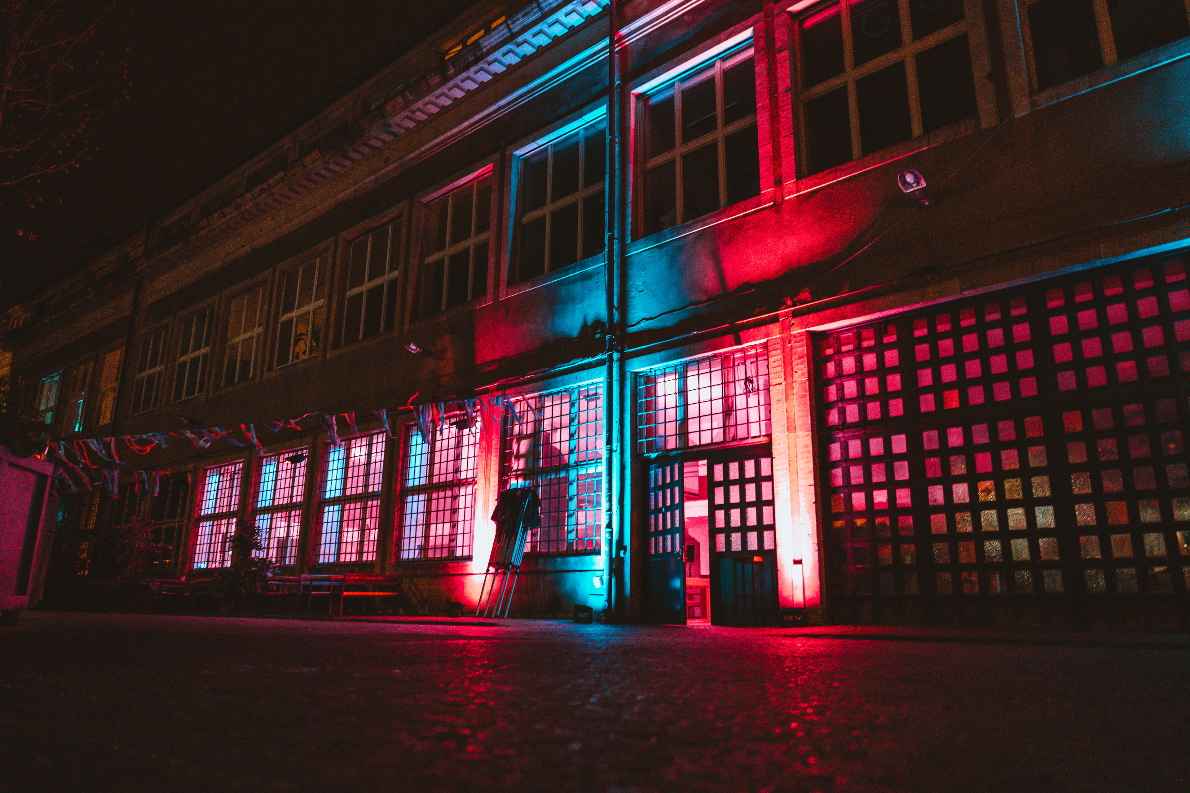
The logo, which was based on the Avant-garde typeface, was made to be used in a flexible and non-restrictive manner, visually representing the cross-chain technology. The colours are vibrant hues of pink, blue and purple, providing a wide spectrum of playful graphics to be used in the marketing of this event. The shapes and choice of music were also chosen to convey the decentralised nature of the brand.
There is order in its disorder.
Promotional video trailer
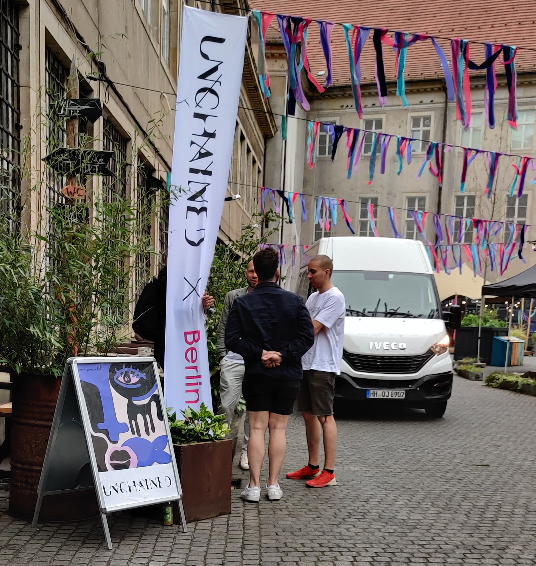
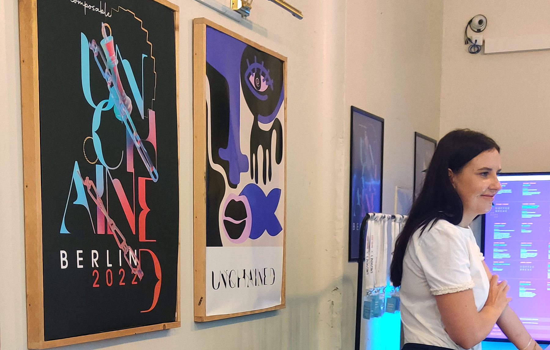
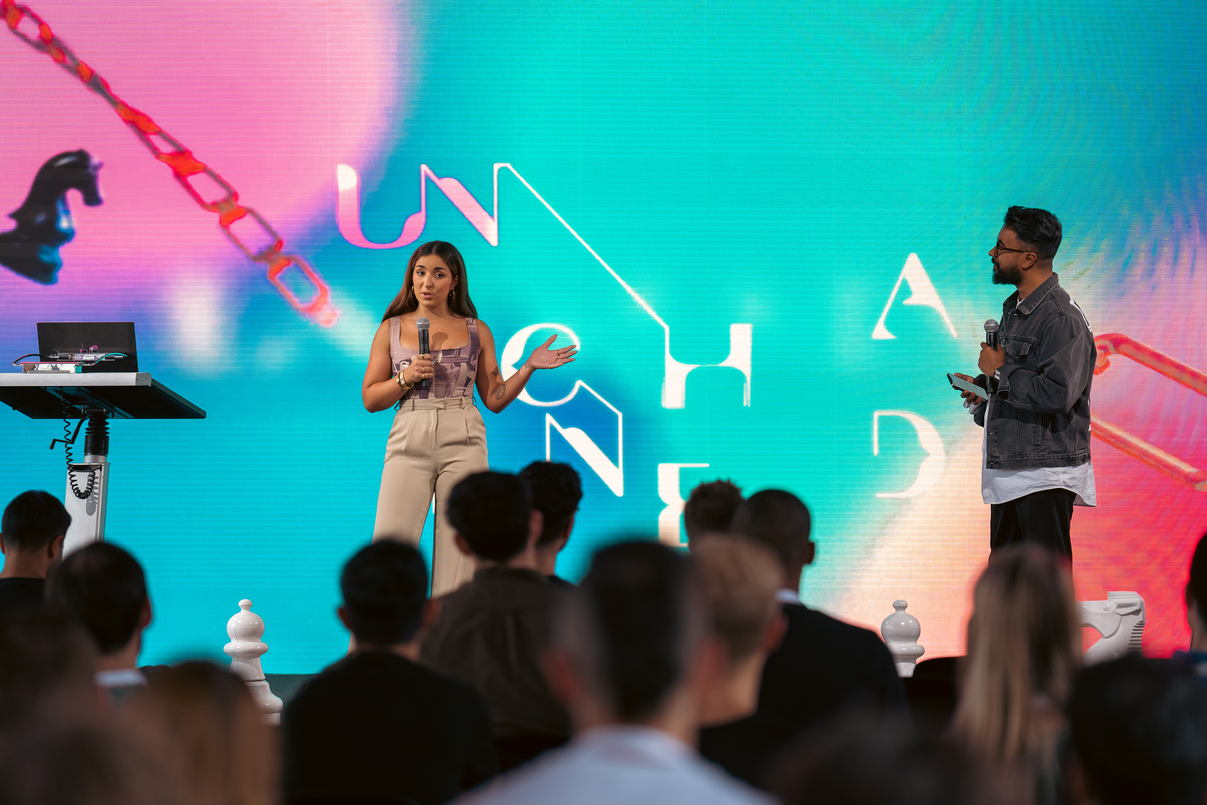
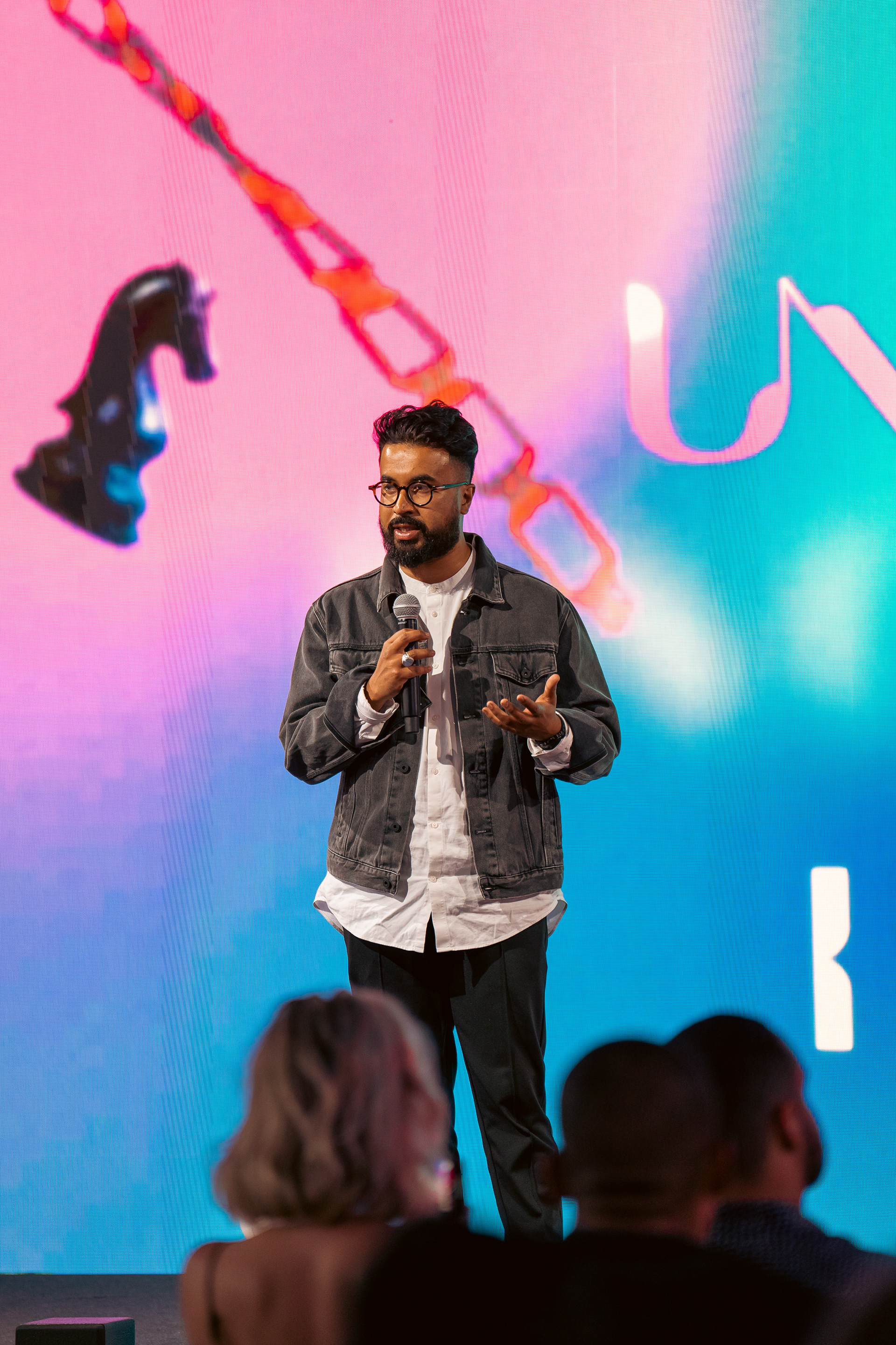
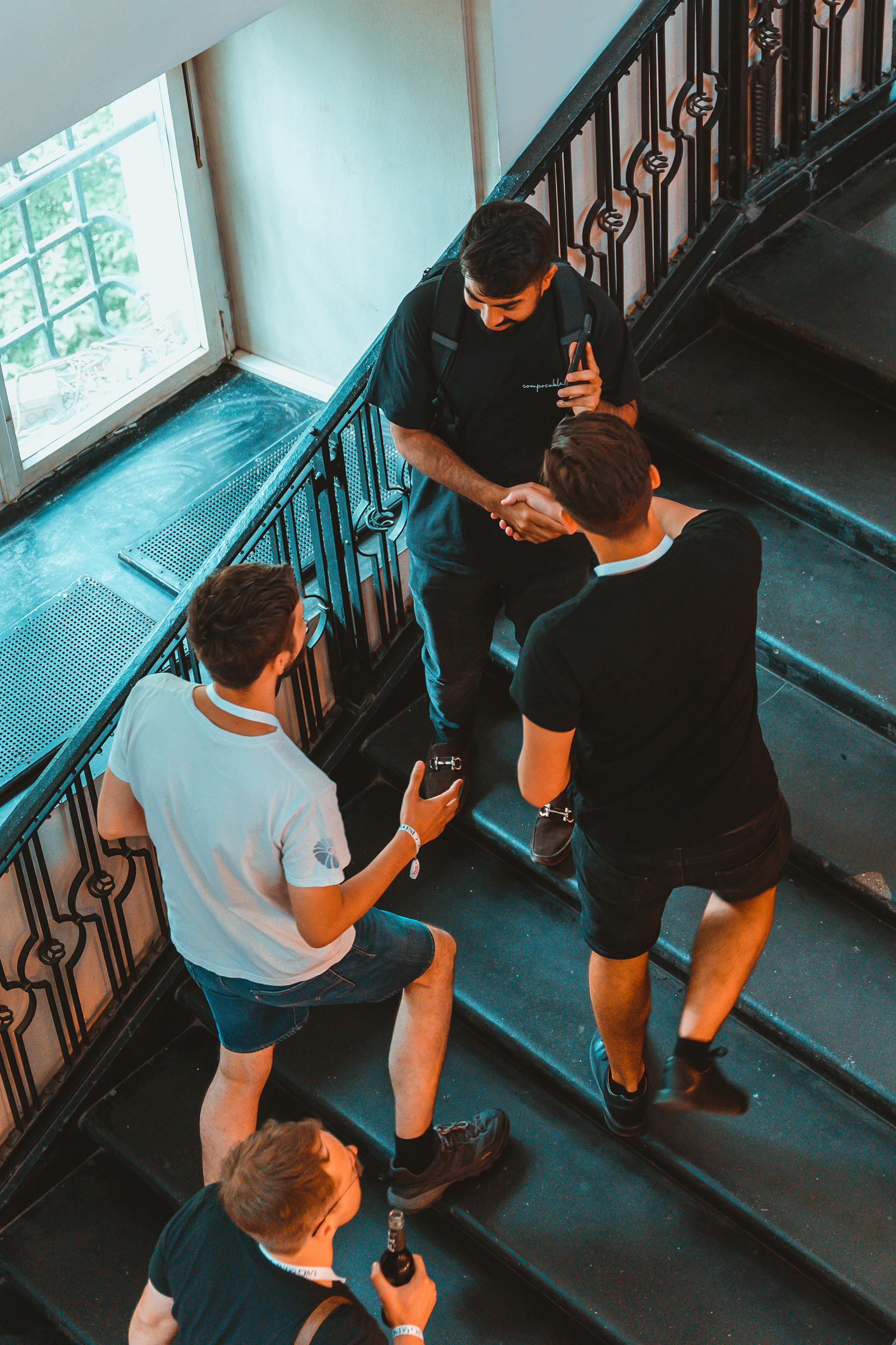
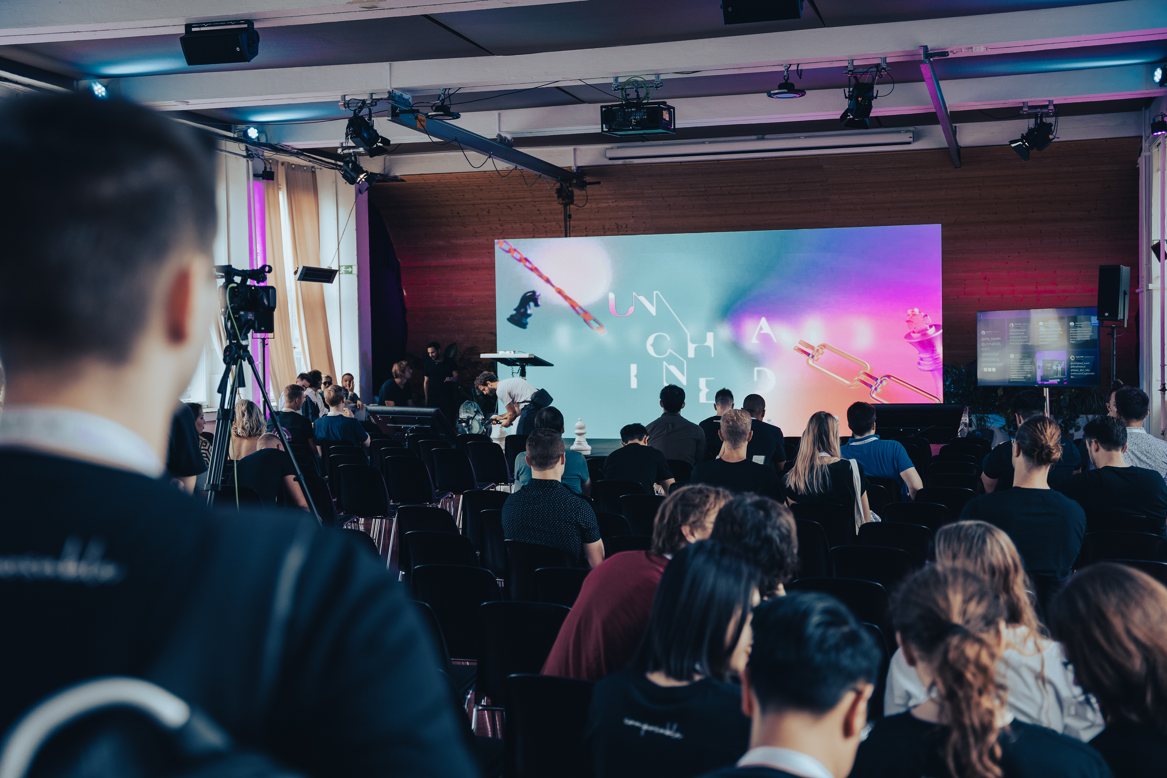
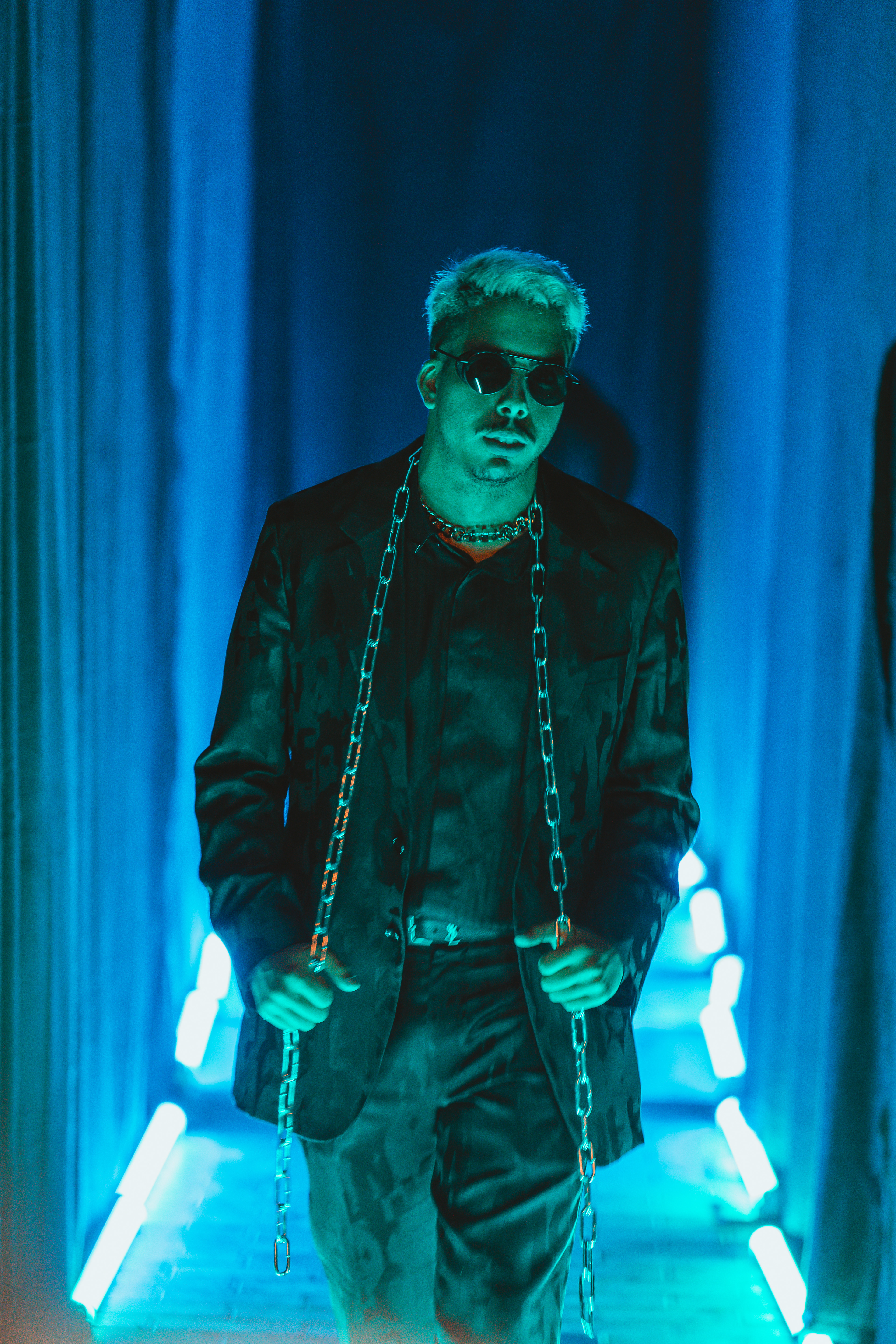
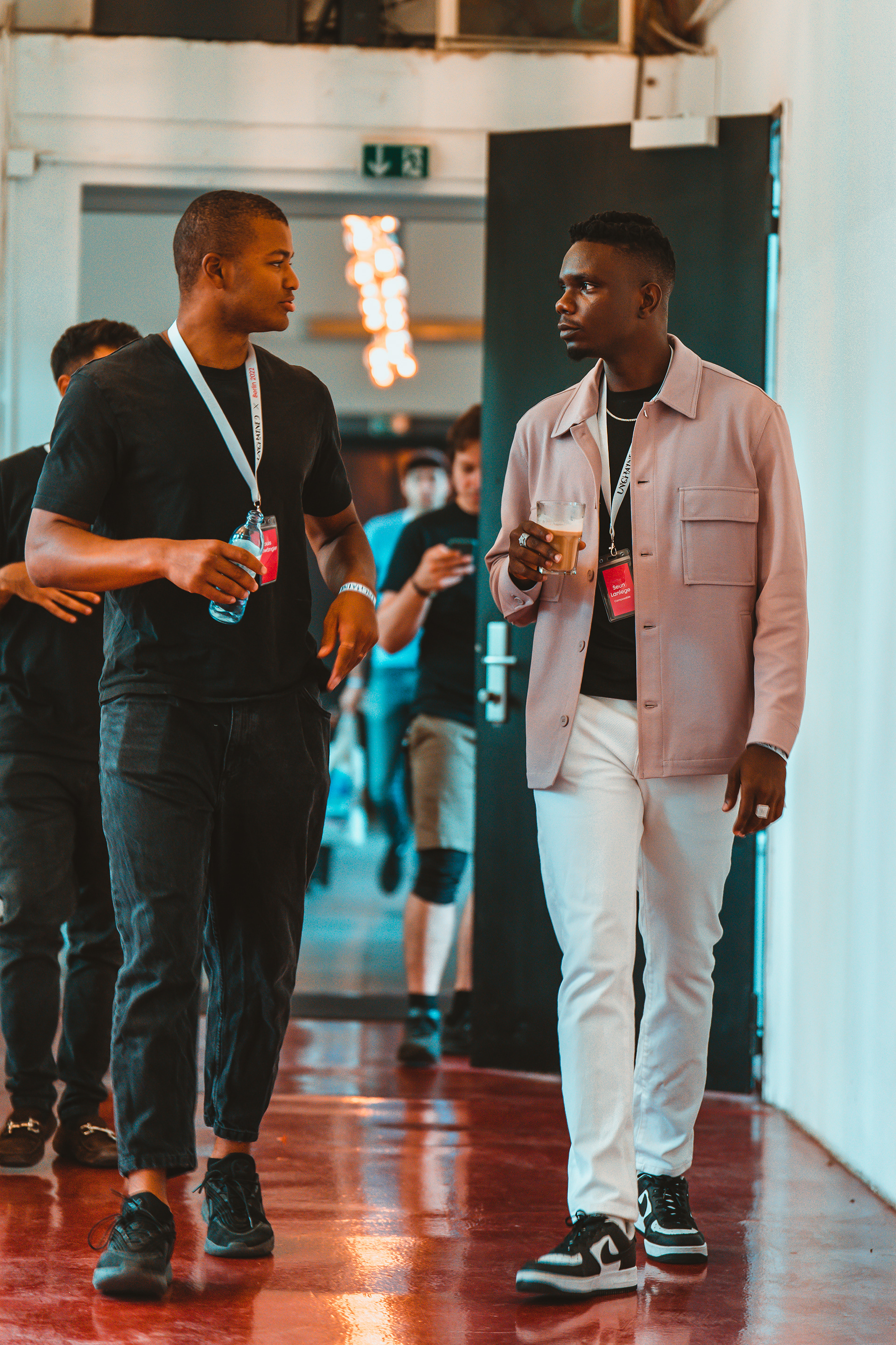
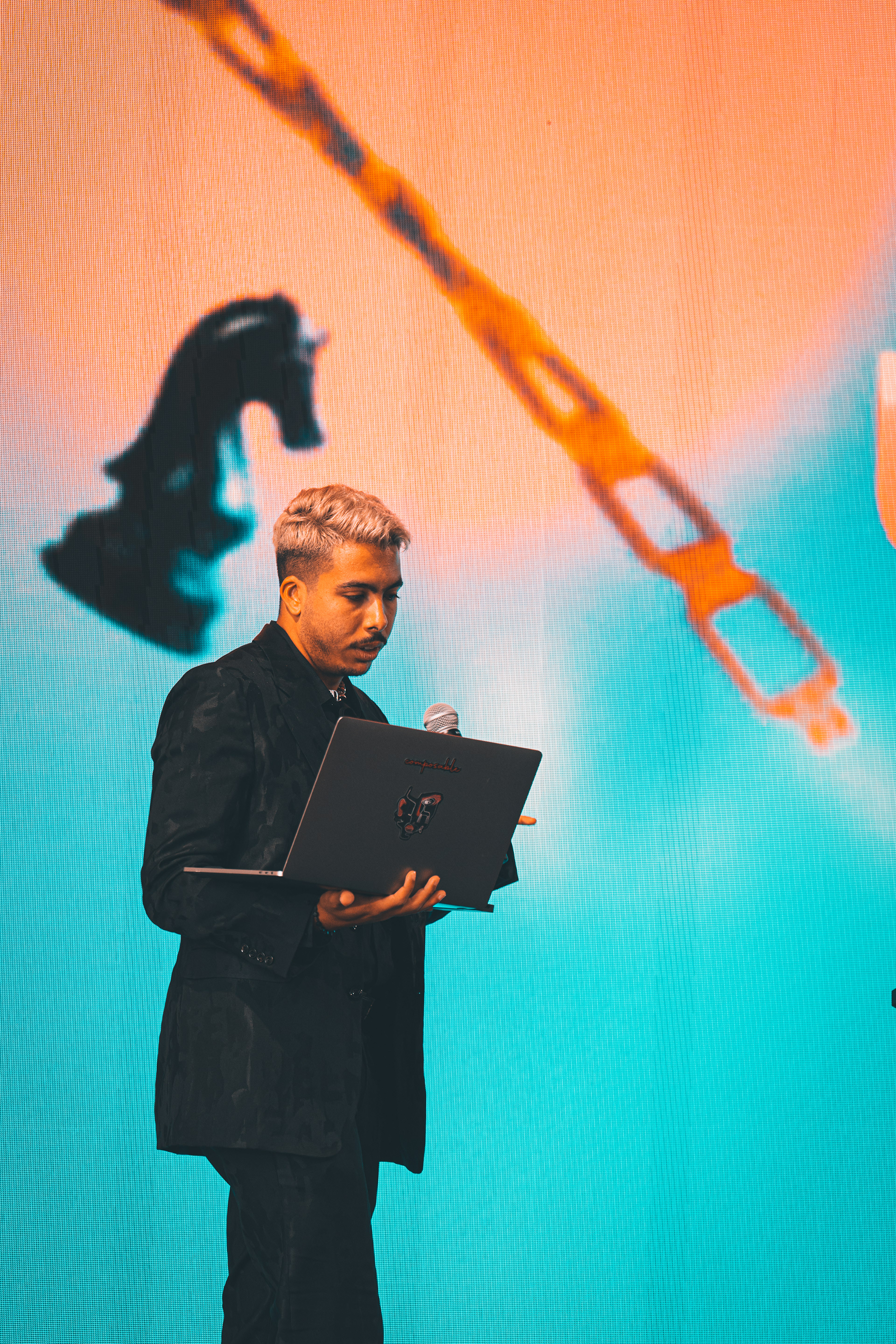
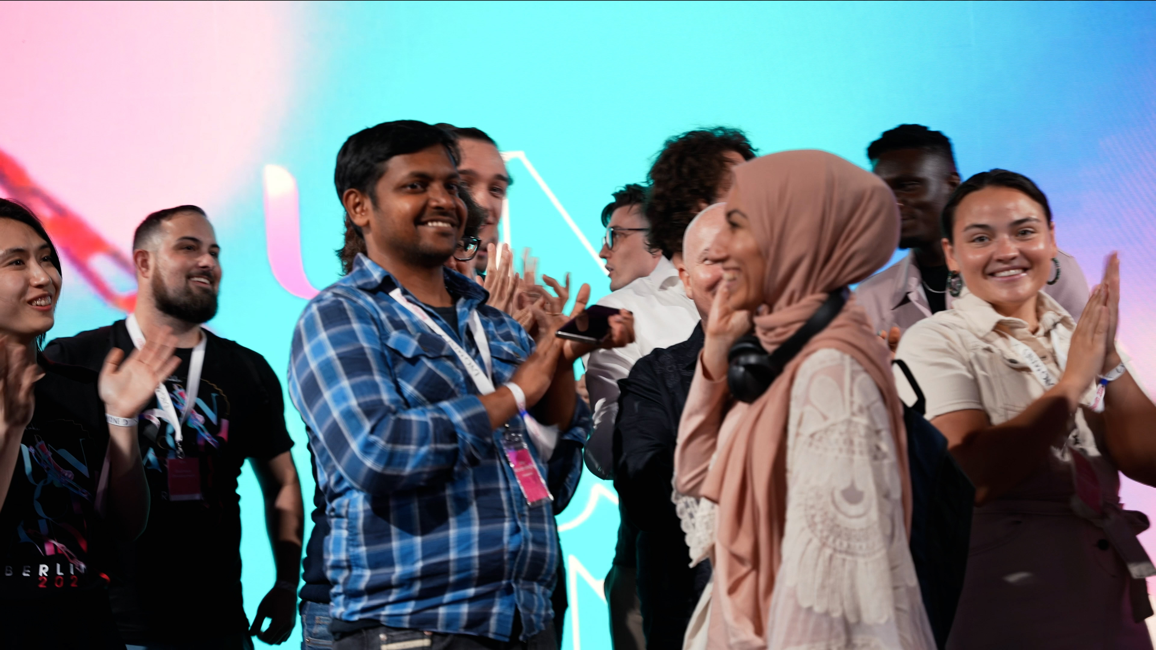
Some of the moments captured from the event

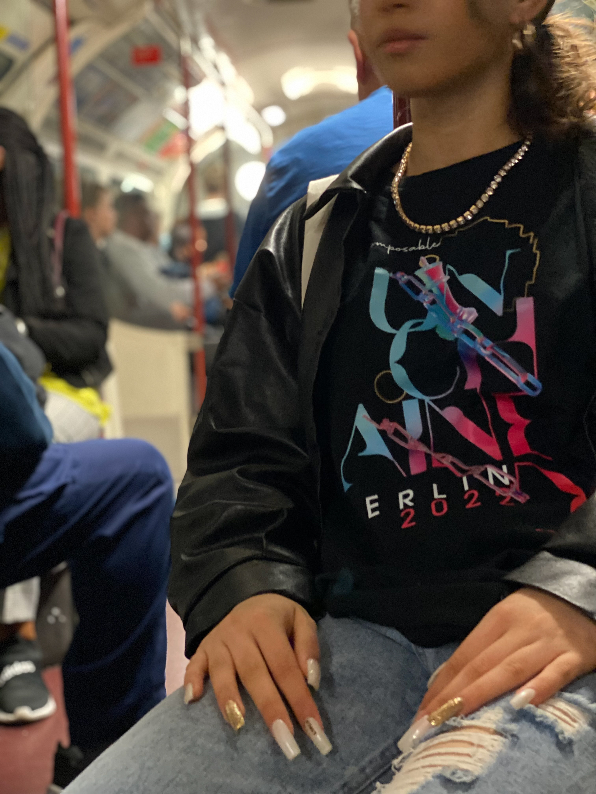
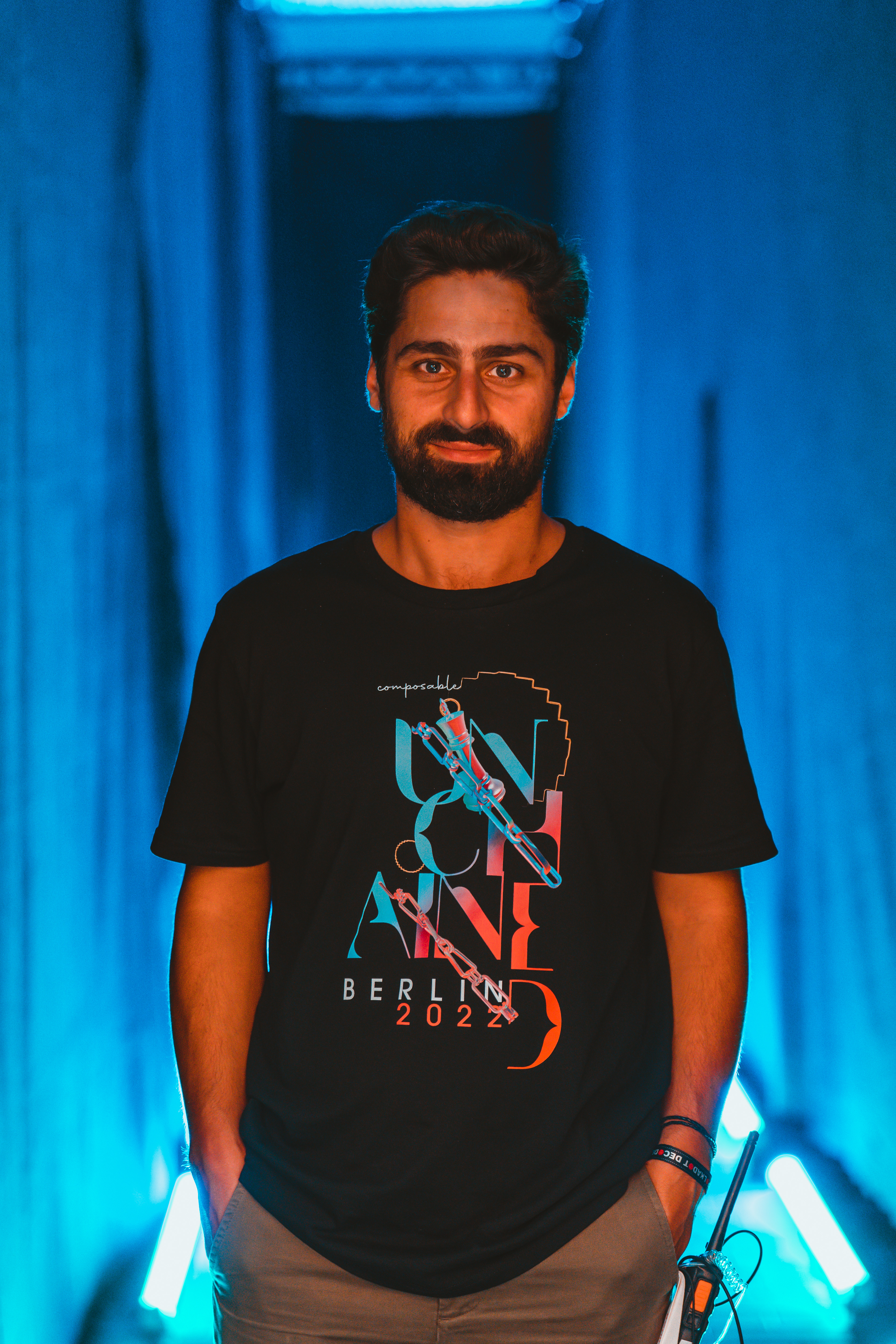
T-shirt design
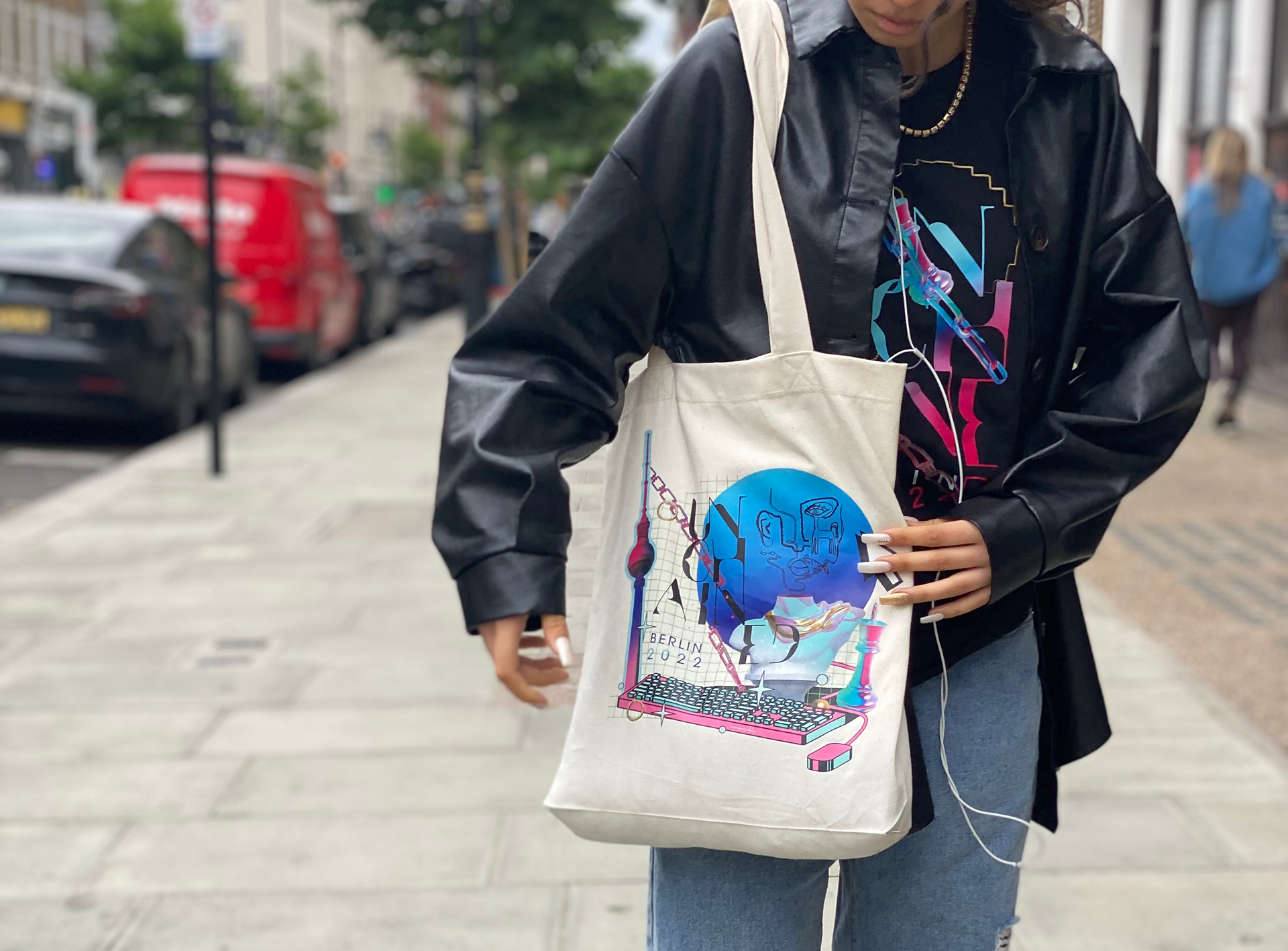
Tote bag design
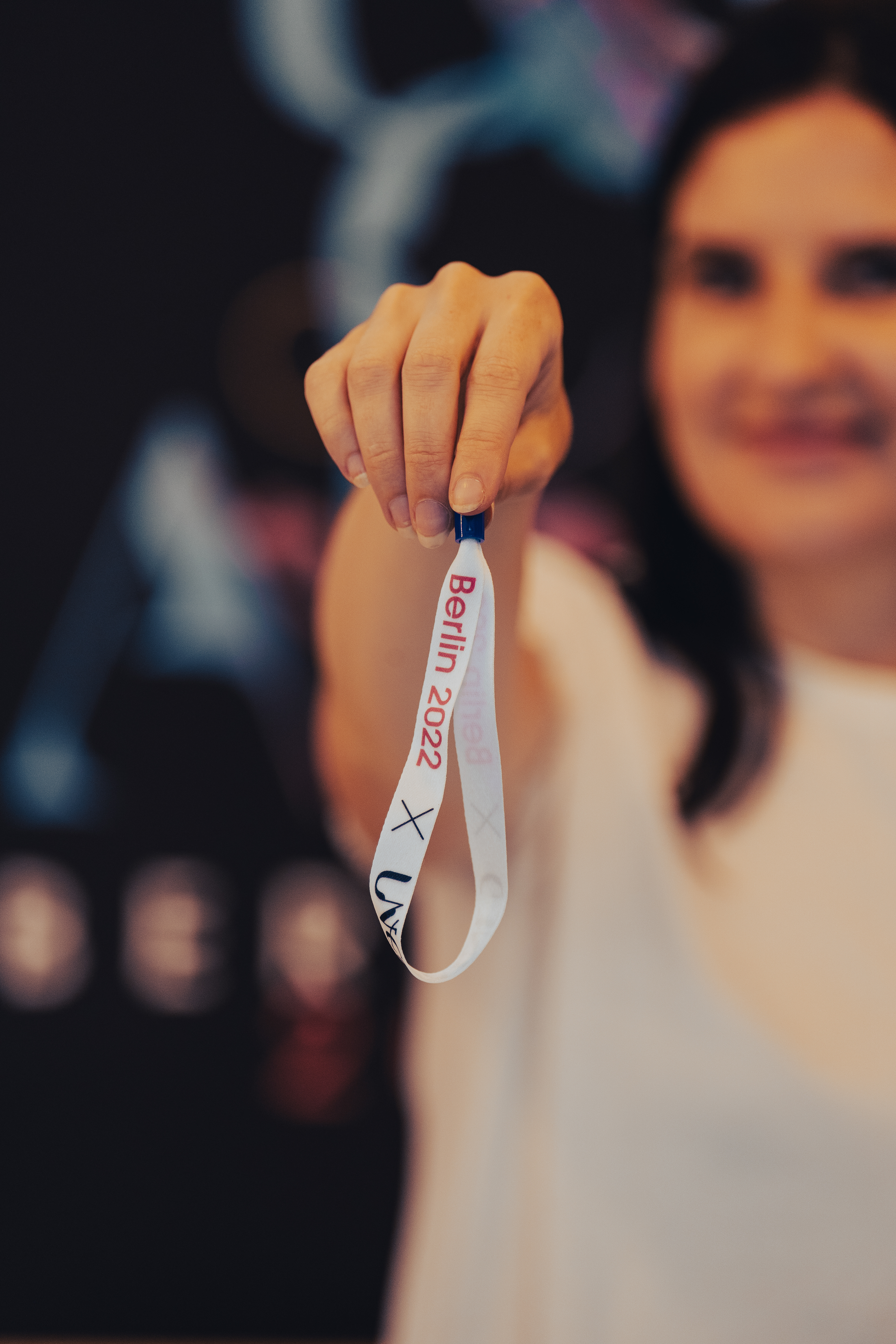
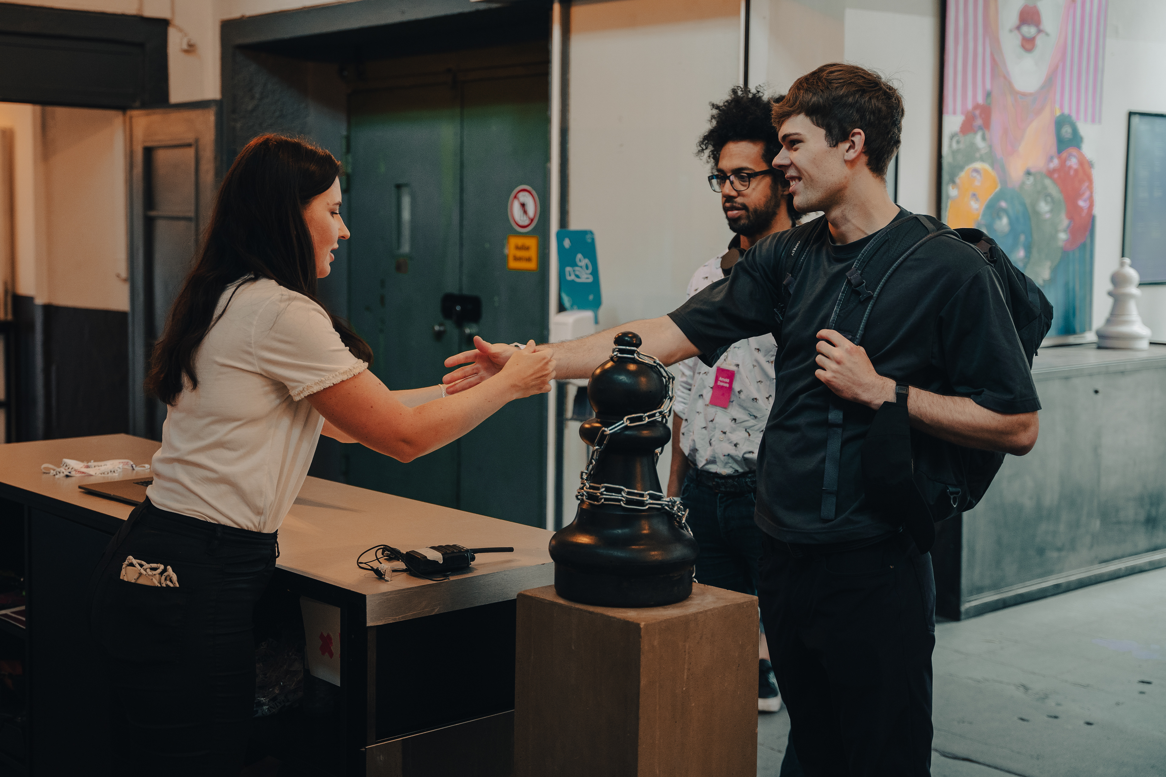
Attendees getting their wrist bands at the reception
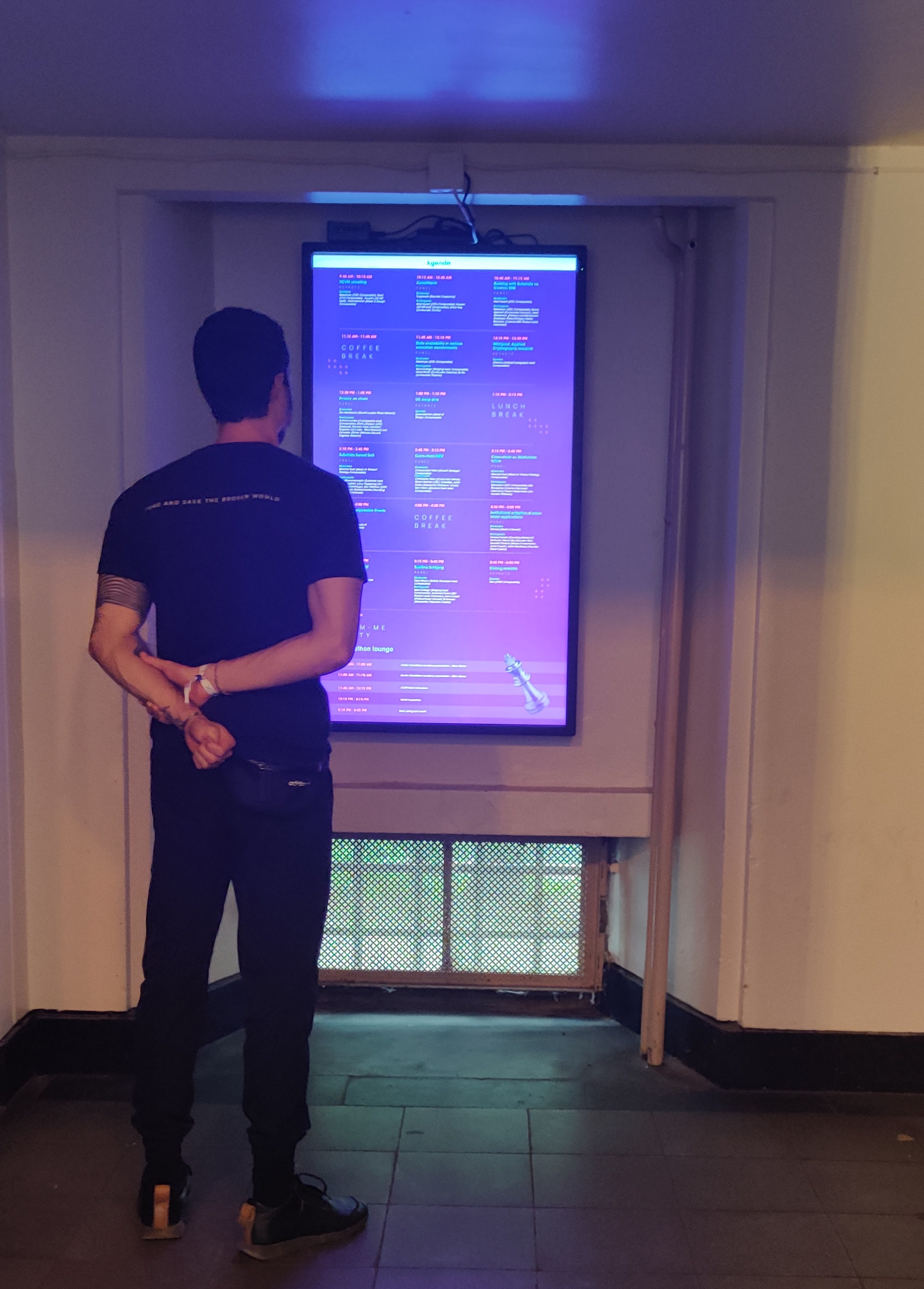
A visitor checking out the schedule

Working away during the event


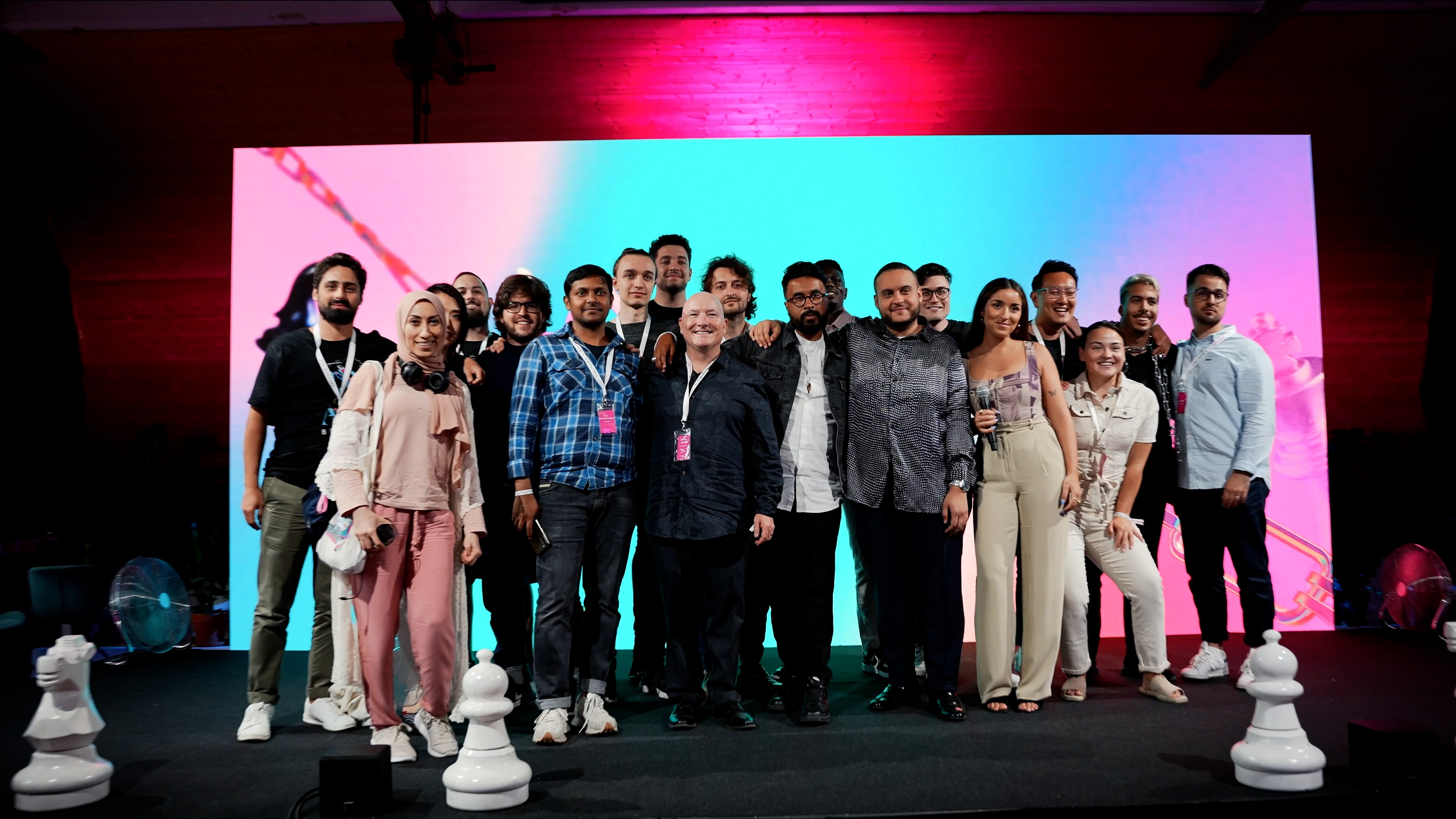
Team photo
Promotional video